Campaign Website Showcase
Introduction
Understanding problems
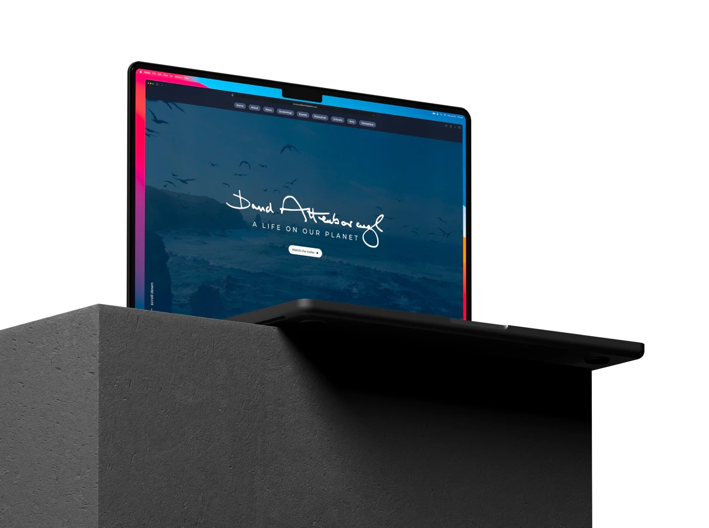
Collaborating with WWF-UK, we created a mobile-first website for Sir David Attenborough's film 'A Life On Our Planet,' serving as a hub for global community action. Through comprehensive event systems and educational resources, the site connects viewers to real-life sustainability efforts, enabling online and in-person events, and sparking a worldwide movement dedicated to conservation and positive environmental impact.
Objectives
Facilitate and broaden opportunities to watch the film
Enable users the ability to share, find and connect with community viewings
Support three primary groups of users, which should encompass education and business
Leverage a modern technical approach to Wordpress, that supports L2 browsers
Host and support the project through a 12-24 month cycle
Develop an visual direction for the campaign
As a preferred supplier for digital projects and user experience design for WWF-UK, we had the opportunity to collaborate on an impactful initiative - the design and development of the website for Sir David Attenborough's Netflix documentary film 'A Life On Our Planet'.
The primary goal of the project was to create a mobile-first website that would serve as a central hub for community action surrounding the film. Our objective was to provide a platform where target audiences could access relevant information, run events, and download valuable resources. The website aimed to bring the documentary's narrative to life and establish a connection between viewers and real-life actions they could take.
One of the key deliverables was the development of a comprehensive events system. This system was designed to cater to different demographics, offering online and in-person screening events. Additionally, schools around the world were given the opportunity to share their pledges publicly, contributing to a global movement of sustainability and conservation.
By working closely with WWF-UK, we were able to translate their vision into a user-friendly and engaging website that empowered individuals and communities to make a positive impact on our planet. The project highlighted the importance of leveraging digital platforms to drive meaningful action and create a global network of change-makers.
Design Process
Design thinking
By combining design thinking and agile methodologies, I empathise with users, define problems, ideate creative solutions, prototype, validate, and implement the best ideas. This iterative process ensures a deep understanding of user needs and efficient project execution, fostering collaboration and delivering exceptional user experiences.
One
Empathise
Gain a profound understanding of users' perspectives, needs, and challenges through research and observation, fostering empathy and generating valuable insights to inform the design process.
Two
Define
Clearly articulate the problem or opportunity based on insights and analysis, synthesising the information to form a focused and actionable problem statement that guides the design process.
Three
Ideate
Generate diverse ideas and concepts through brainstorming and creative thinking. Explore innovative solutions to address the problem or opportunity identified during the design thinking process.
Four
Prototype
Transform ideas into tangible representations, using various tools and techniques, such as wire-framing and prototyping, to validate and iterate on design solutions through user testing.
Five
Validate
Test and gather feedback on the prototypes to evaluate their effectiveness and alignment with user needs. Iterate based on insights gained to refine and improve the design solution.
Six
Implement
Translate the refined design solution into a functional product or service, utilising the necessary tools, technologies, and resources. Ensure seamless integration and bring the design vision to life.

1
Empathise
2
Define
3
Ideate
4
Prototype
5
Validate
6
Implement
Tool stack
Using key tools like Figma, Miro, and Framer, I streamline workflows, enhance ideation, and create intuitive prototypes. Coupled with Typeform and ChatGPT for insightful user research, I deliver top-tier, user-aligned digital solutions, fostering innovation and impactful experiences.
Understanding Phase
Empathise with users and define the problems
In order to meet the fixed schedule and maintain high project velocity, we adopted an agile approach and prioritised efficiency throughout the process of working on the website for Sir David Attenborough's Netflix documentary.
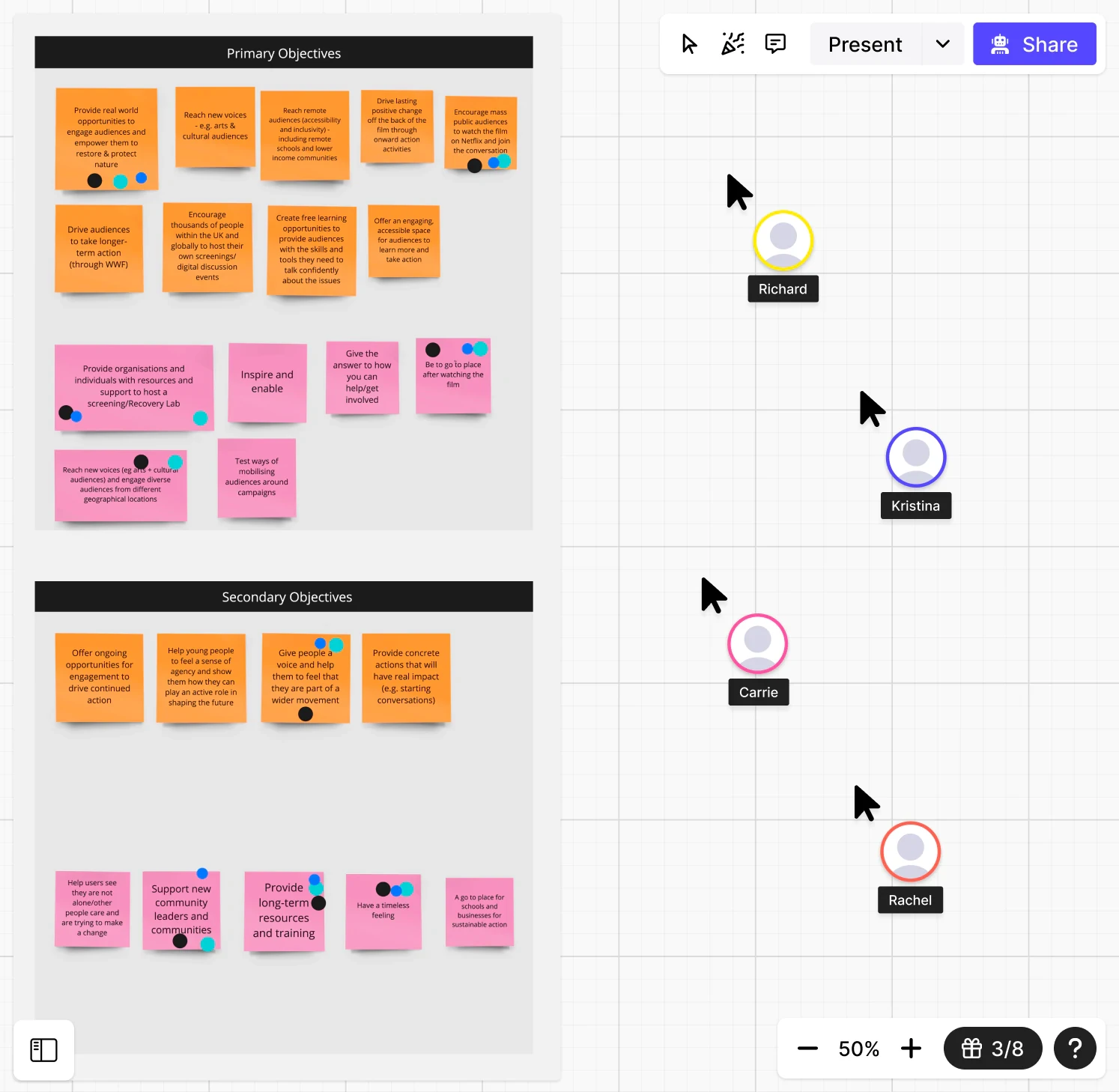
Early workshops with the WWF-UK team allowed us to delve deeper into the project's requirements and objectives. Through facilitated discussions and collaborative exercises, we collectively defined and agreed upon the primary and secondary objectives for the project. This helped us align cross-team and establish a clear direction.
To ensure we achieved our objectives, we conducted two key stakeholder workshops. These sessions employed dot voting to prioritise the most critical elements and rapidly move towards early block-frames and wireframes. The active involvement of WWF stakeholders in the design process played a crucial role in defining and iterating on the designs. As a result, there were fewer surprises and reduced sign-off times at each phase, as stakeholders were involved and informed throughout the project.
By embracing a collaborative and iterative approach, we were able to streamline the decision-making process and maintain a high level of transparency and stakeholder engagement. This allowed us to deliver a website that effectively conveyed the documentary's message and empowered users to take action for a sustainable future.
Pandemic challenges
Due to the COVID-19 pandemic restrictions, the pre-engagement and original planning for the wider digital and in-person experience had to go through a readjustment period before the WWF and partners where ready to re-engage with suppliers. The originally planned in-person physical screenings experience, which users where envisioned to promote on the platform, had to be cancelled and established as digital only ‘watch-parties’. Furthermore, during the project lifespan these evolved as the pandemic restrictions where reduced. This impacted on the scope and planning for the systems we ended up needing to build.
Research
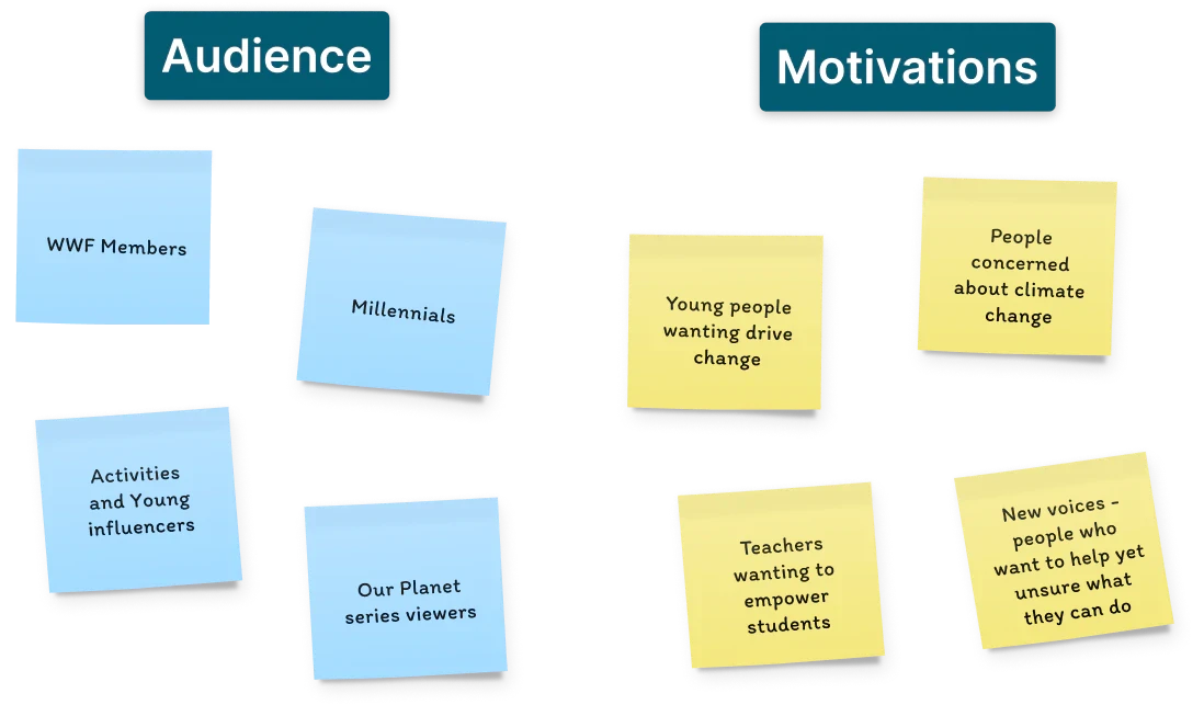
Seeking to understand and empathise with our audience, we were able to uncover their key motivations and align them with our design concepts. This valuable insight informed the development of personas that accurately represented our target users. With the personas in place, we were able to design the website in a way that resonated with our audience, reinforcing the core message of the documentary and inspiring them to take action.
The feedback and insights gathered during this process were integrated into the WWF master personas document, ensuring that our designs were grounded in a comprehensive understanding of our target audience. By incorporating empathetic objects and elements into the website, we aimed to create a meaningful connection with users, fostering a sense of urgency and driving them to engage with the content and take tangible actions for the betterment of our planet.
Empathy & Personas
By combining the user research conducted by WWF-UK with our own interviews and stakeholder workshop sessions, we were able to gather a comprehensive understanding of the target audience. The existing user research provided valuable insights into user behaviours, preferences, and motivations, while our own interviews and workshop sessions allowed us to dig deeper and gain additional perspectives.
The synthesis of these research efforts enabled us to create robust and accurate personas that represented the diverse range of users we were targeting. These personas became the foundation for our design decisions, ensuring that the website catered to the specific needs, interests, and behaviours of the intended audience.
By getting to know our audience, we pinpointed their main drives. This shaped our personas, which then influenced the WWF master personas. With this insight, we designed a site focused on empathy, amplifying our message and prompting action.
leveraging the insights from both the existing user research and our additional research efforts, we were able to design a website that resonated with users, addressing their pain points and providing them with the information and resources they needed to take action and make a positive impact on our planet.
We conducted in-depth user research and analysis to identify key personas that aligned with the master personas provided by WWF-UK. Through interviews, surveys, and stakeholder workshops, we gained valuable insights into the diverse needs and motivations of our target audience. These personas represented different user groups, including educators, businesses, and individuals who watched the documentary on Netflix.
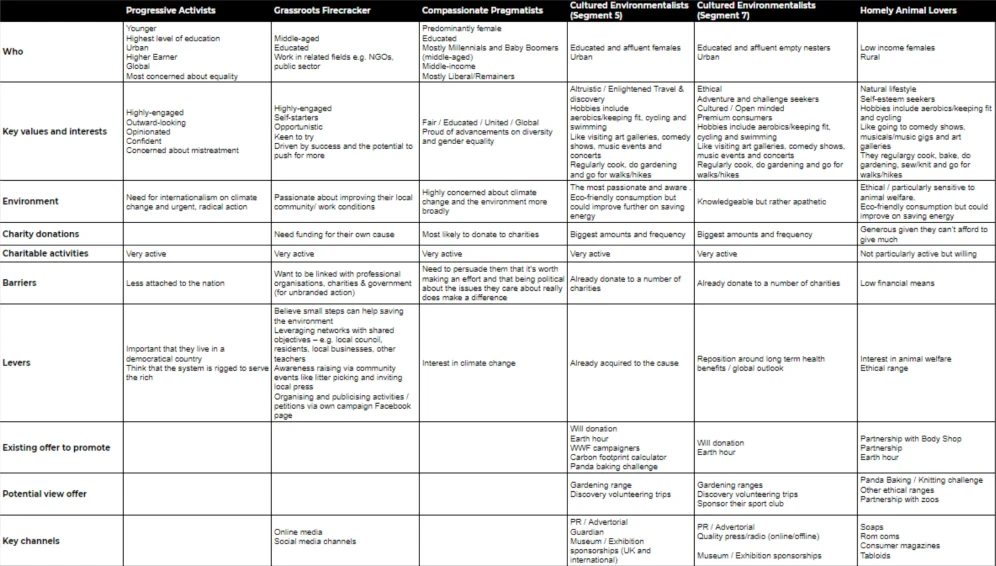
WWF’s own persona research formed a critical component of the wider groups, and thus the emotive drivers that formed the wider bases for our own research and designs.

By understanding the specific needs and preferences of each persona, we were able to design the website to cater to their unique requirements. For example, the education-focused persona required access to educational resources and information about running events in schools. The business-oriented persona needed information on corporate sustainability initiatives and ways to get involved. The Netflix viewer persona sought ways to take action and make a positive impact after watching the documentary.
With these personas as our guide, we crafted user-centred experiences, ensuring that the website content, features, and functionality resonated with each persona's goals and interests. This approach allowed us to create a cohesive and tailored user experience that engaged and inspired our target audience, fostering a sense of connection and empowering them to take meaningful action in response to the film's message.
Flows and Architecture
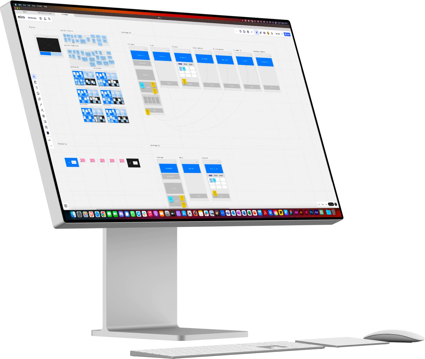
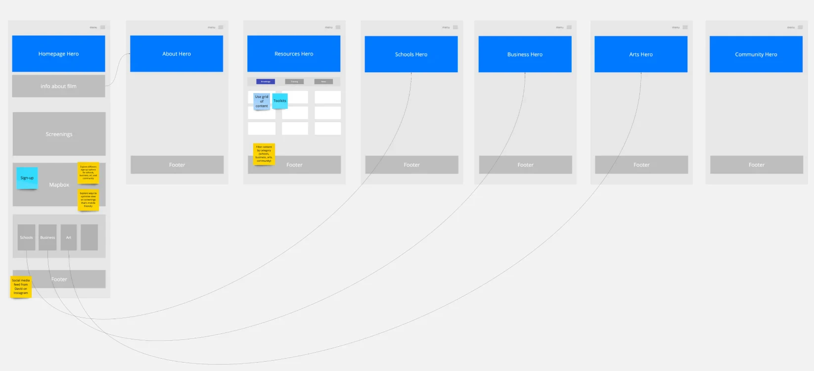
We engaged in collaborative block-framing and wire-framing sessions with stakeholders, leveraging the valuable UX insights gathered from previous sessions. These sessions allowed us to define the information architecture of the website and validate its sitemap and user journey. By using collaborative and agile tools, we facilitated efficient and iterative discussions with customers, enabling us to make rapid progress towards refining wireframes and establishing the art direction.
The collaborative nature of these sessions, combined with a focus on information architecture, played a crucial role in ensuring alignment between stakeholders and delivering the project on time for the film's release. By actively involving stakeholders and customers in the design process, we were able to gather real-time feedback, make informed decisions, and iterate quickly to create a website that had a clear and intuitive structure. This approach fostered a sense of ownership and collaboration, resulting in a more seamless and impactful user experience.
Explore
Ideate solutions and prototype
As we move through the design process, the fidelity of our deliverables increases, thanks to the active involvement of stakeholders, individual user testing, and the development of soft prototypes. This iterative approach allows us to refine and enhance our design concepts based on valuable feedback and insights.
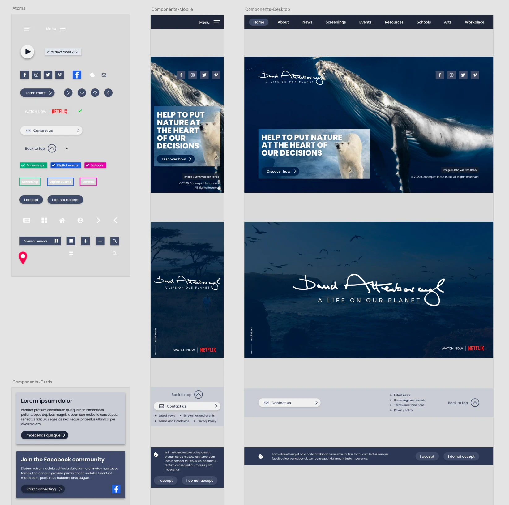
During this process, we organically develop base-level atoms and components, such as buttons and cards, which serve as the building blocks of our design system. These components are initially designed in a neutral and flexible manner, allowing for easy customisation and white-labelling. As we progress into the art direction phase, we refine these elements further to align with the desired visual style and brand identity, creating a micro-design system specifically tailored to the website.
By following this approach, we ensure that our design components are both functional and visually cohesive, enhancing the overall user experience while maintaining flexibility for future customisation and branding requirements.
Visual Identity
Although no formal brand or identity was created specifically for the film and campaign website, we recognised the need to establish a distinct look and feel that resonated with the emotive messages and personal story conveyed in the film. Working closely with stakeholders, we drew inspiration from elements within the film, associated assets, and images of Sir David Attenborough to refine a basic aesthetic that captured the essence of the story. By aligning the visual direction with the film's themes and emotions, we aimed to create a cohesive and immersive experience for visitors to the campaign website.
We approached the iteration of the visual identity in a holistic manner, incorporating multiple art direction rounds with the customer. This approach enabled us to tailor the visual identity to the overall website experience, ensuring a cohesive and integrated design. By considering the visual identity in the context of the entire site, we were able to create a seamless and engaging user experience that reflected the brand's essence.
Pattern Libraries
To meet the required velocity of the project, we implemented a design approach centred around a functional pattern library. This allowed us to efficiently test and refine project elements at a component level, ensuring their functionality and usability. By designing reusable components within the pattern library, we were able to implement them consistently across the site, saving time and effort in development and ensuring visual and functional consistency throughout the project. This approach enabled us to achieve the desired velocity while maintaining a high level of quality and coherence in the design implementation.
Visual Experience
The project involved a significant focus on user interactions, such as sharing information, setting up community film viewings, and hosting competitions. To facilitate these interactions, we carefully mapped out the necessary forms, ensuring reusability of code and flexibility. It was crucial to create robust and user-centric forms, paying attention to the language used and ensuring a seamless experience for users. By prioritising usability and flexibility, we aimed to enhance user engagement and facilitate smooth interactions throughout the website.
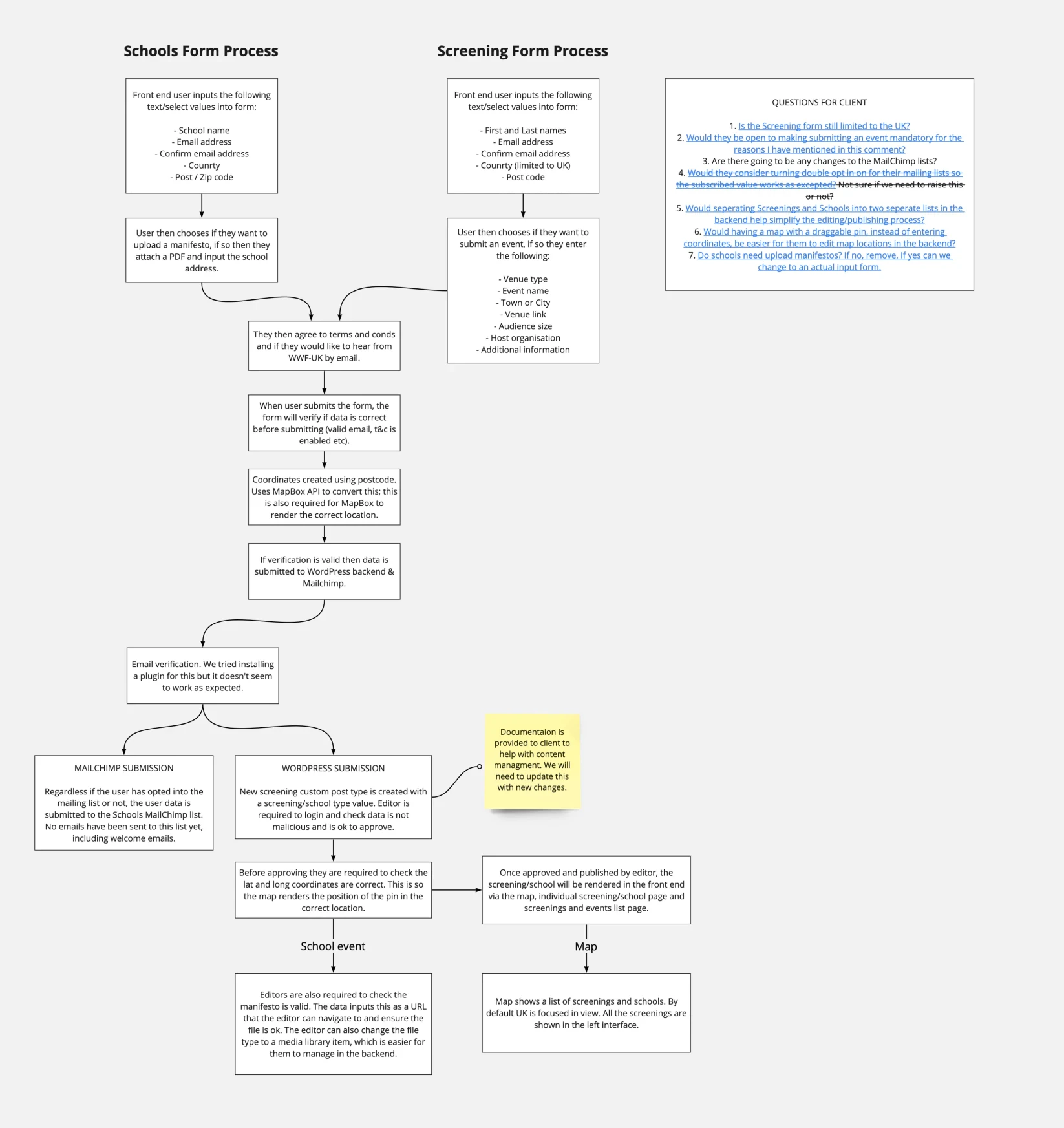
The project involved a significant focus on user interactions, such as sharing information, setting up community film viewings, and hosting competitions. To facilitate these interactions, we carefully mapped out the necessary forms, ensuring reusability of code and flexibility. It was crucial to create robust and user-centric forms, paying attention to the language used and ensuring a seamless experience for users. By prioritising usability and flexibility, we aimed to enhance user engagement and facilitate smooth interactions throughout the website.
Materialise
Validate and implement
During the "Materialise" phase, our main goal was transforming our conceptual ideas into a working digital platform. As a team, we believed in a cross-functional approach, and this belief influenced how we organised our roles.
I spearheaded the initiative, navigating both stakeholder expectations and the project’s intricate details. My dual role involved overseeing the UX/UI design, ensuring that our creative direction stayed on track, and remained aligned with our budgetary constraints.
Our talented front-end developer utilised Next.js and WordPress, bringing the designs to life. Beyond mere coding, he played a pivotal role in quality assurance, ensuring every user interaction felt intuitive and met our specifications.
Quality assurance wasn’t just an afterthought; it was integral. Our dedicated specialist combined automated methods with hands-on testing. The focus was clear: to make sure our platform consistently adhered to the Level 2 browser support we'd committed to.
Security, an undeniably crucial aspect, was the domain of our back-end expert. Even though his contribution was brief, it was significant, ensuring the safety and reliability of our platform.
All these efforts combined culminated in this phase, marking our journey from concept to a tangible digital experience, made possible by a synergistic team effort.
By leveraging a headless architecture, we implemented a decoupled approach to the WordPress build for the campaign website. This involved separating the frontend and backend functionalities, allowing for greater flexibility, scalability, and performance optimisation. With Next.js as the frontend framework, we created a fast and dynamic user interface that interacted with the WordPress backend through the REST API. This headless setup enabled us to deliver a seamless user experience while maintaining the robust content management capabilities of WordPress. It also allowed for easier integration with third-party services and future scalability as new technologies and platforms emerge.
What is ‘Headless’?
"Headless" refers to a software architecture and design pattern where the front-end (the "head") is decoupled from the back-end. In the context of content management systems like WordPress, going "headless" means using WordPress merely as a content management back-end, and leveraging a different technology for the front-end presentation.
Since the front-end is decoupled, designers and developers aren't constrained by WordPress themes. They can craft bespoke user interfaces and user experiences without worrying about WordPress theme restrictions. Traditional WordPress sites render content on the server-side using PHP. In a headless setup, content is typically fetched via the WordPress REST API (or a custom API) and rendered on the client side. This can lead to faster webpage load times, especially if you're using modern JavaScript frameworks like React, Vue.js, or Angular.
It's easier to integrate third-party services when the front-end is separated. For instance, you might pull in product data from an e-commerce system, user data from a CRM, and content from WordPress, all integrated seamlessly in a unified front-end. If you ever decide to move away from WordPress in the future, having a decoupled front-end could make the transition smoother. The front-end could remain largely the same, while only the back-end is swapped out.
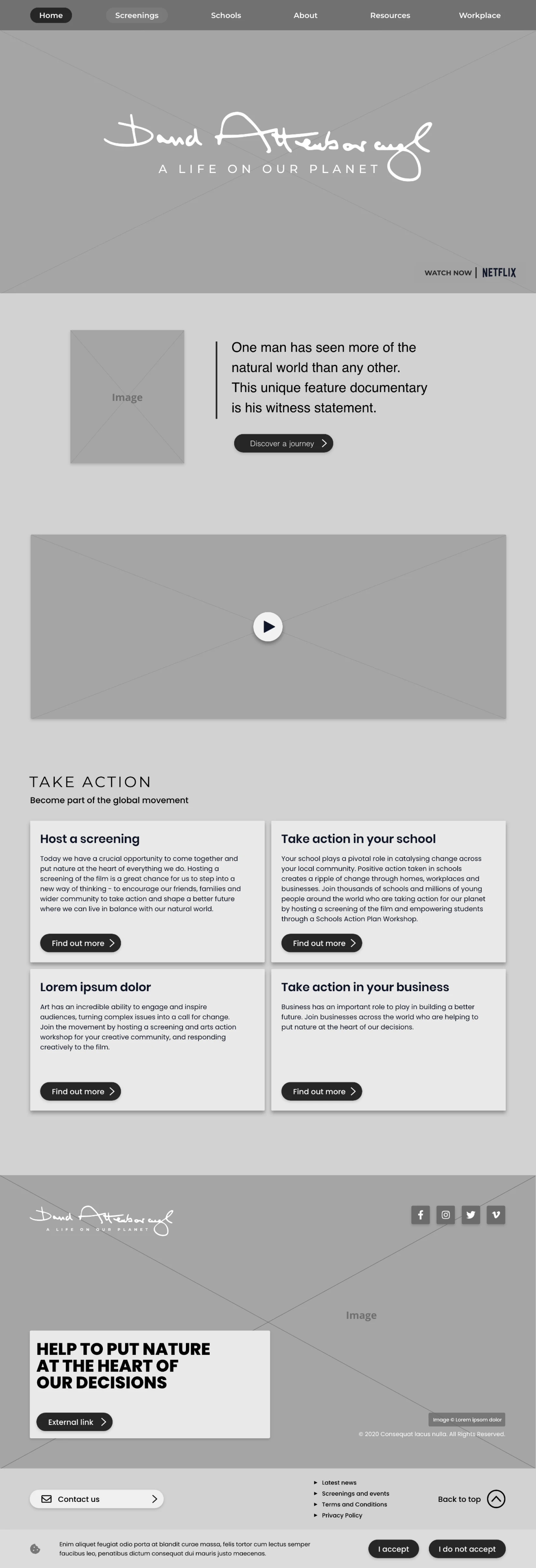
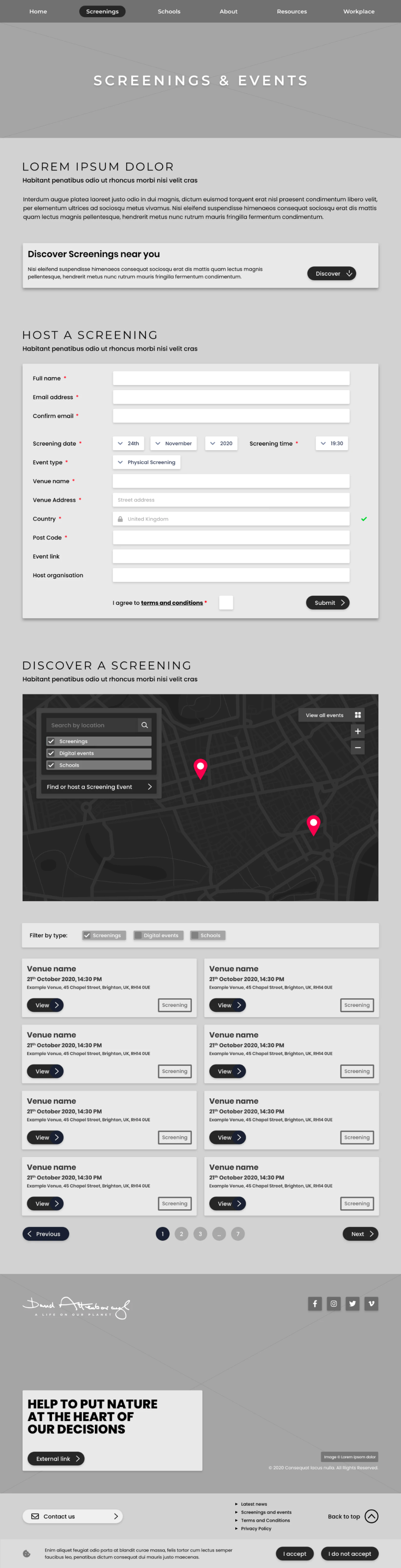
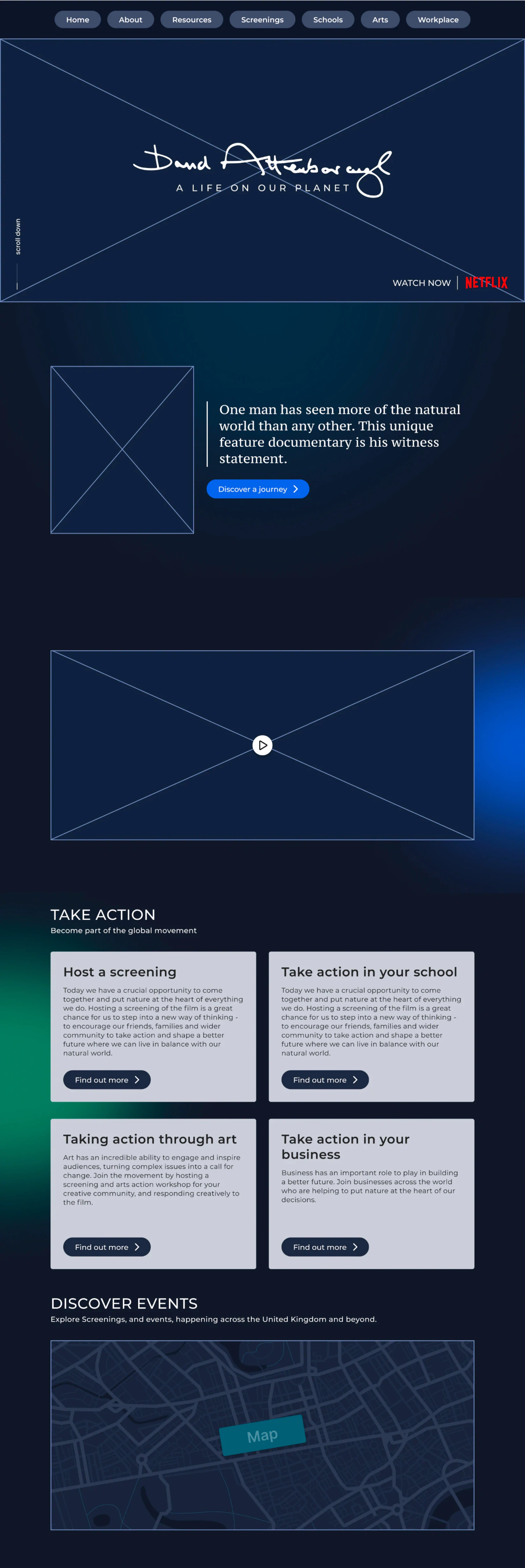
Screenings
From the very beginning, our mission was crystal clear: to cultivate a fervent community centred around the film. A community which resonates with the joy of shared cinematic moments, kindles passionate debates, and inspires collective endeavours. We dreamt of a space where the film's allure didn't simply fade as the credits rolled, but one where its essence lingered, fostering sustained interactions and discussions. Drawing from WWF's initial concept, we meticulously carved out the 'Screenings' section. This wasn’t just a digital tool or a feature; it stood as the very soul of our initiative, a vibrant nexus where film aficionados and 'change makers' could gather, bond, and ignite change together.
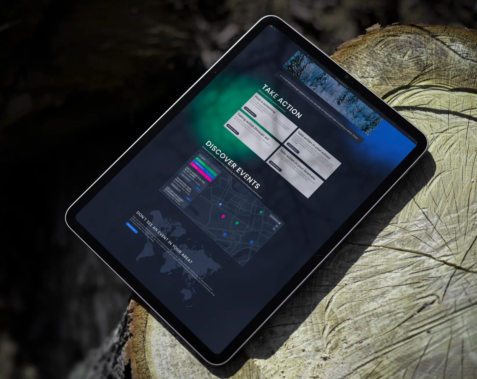
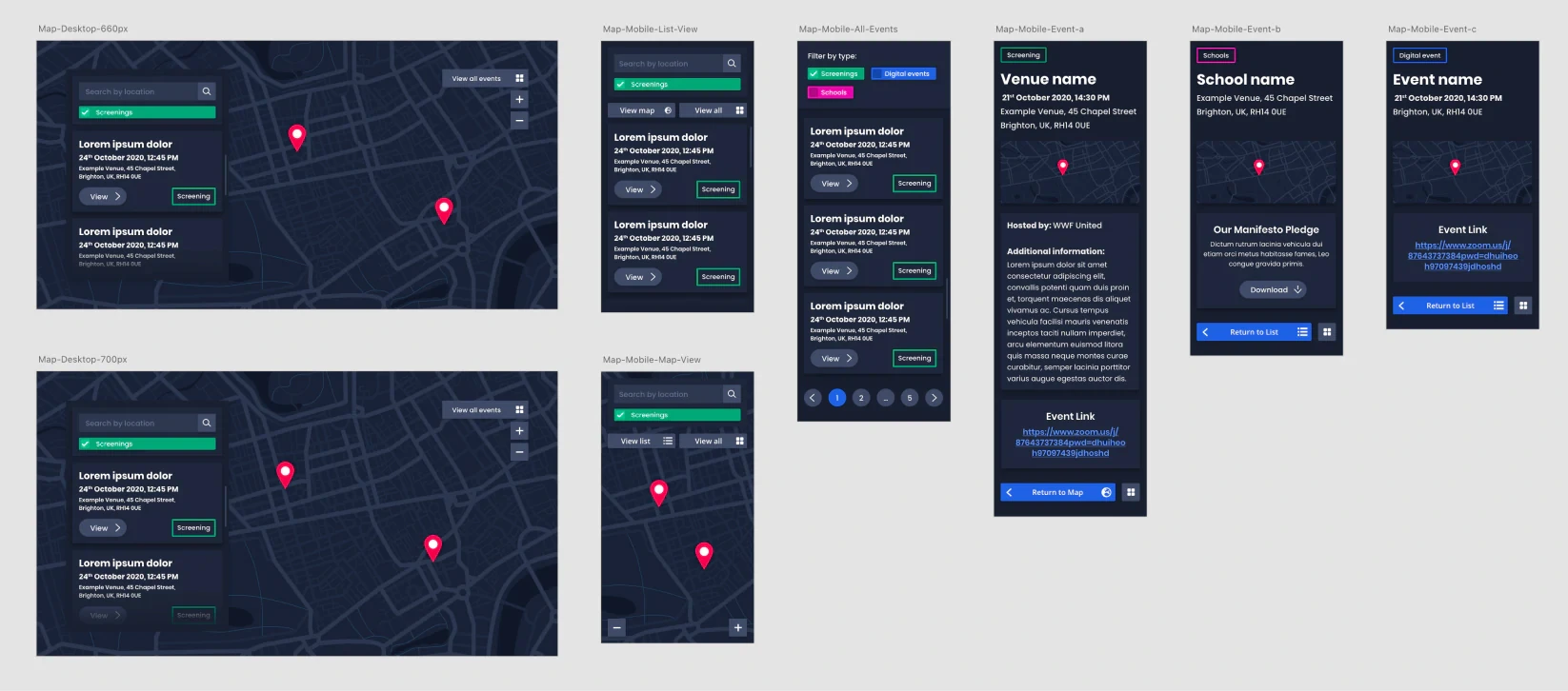
Custom map experiences
The interactive map was the linchpin of this vision. Users could seamlessly search for screenings using various criteria – be it location or other specific taxonomies. Physical screening events dotted across the map invited users to discover new experiences close to them or perhaps in areas they intended to visit.
Once discovered, the website facilitated easy sharing – allowing for wider audience reach and fostering a sense of unity. Discussions were actively encouraged, transforming screenings from solitary experiences into collective discourses. The hope was that post-screening, the discussions wouldn't just centre around the narrative or cinematography, but would delve into deeper issues that the film sought to highlight, leading to potential solutions and community actions.
By intertwining the digital realm of Netflix with the tangible world, we created an environment where every user, regardless of their location, could be part of a larger dialogue. The 'Screenings' section became more than just a feature – it evolved into a dynamic hub for community growth and impactful discussions.
Conclusions
Realising efficiency and cost-effectiveness
‘Working on 'A Life On This Planet' provided a unique opportunity to collaborate with prominent organisations like the World Wide Fund for Nature, Netflix, and Silverback Films. Our collective aim was clear: promote Sir David Attenborough’s profound insights and observations concerning our planet's well-being.
An important aspect of this project was Netflix's decision to ease typical public airing regulations, allowing for broader community-based viewings. This move emphasised the film's significance and Sir David’s unique perspective of merging personal anecdotes with holistic environmental observations.
The challenges introduced by the pandemic necessitated that we adapt our initial strategies. In our collaboration with WWF, we swiftly realigned resources and strategies, ensuring that the primary objectives of the project remained in focus. The platform's design, development, and launch within a tight seven-week timeframe showcased our team's agility, efficiency, and adaptability.
Feedback from our partners has been overwhelmingly positive. The client shared, "Rocket Eleven were brilliant to work with. They delivered an engaging website which exceeded expectations, constantly offering expert advice to make our visions tangible. The team displayed an authentic interest in the project, with a personal drive towards fostering genuine change. We hope that this collaboration will inspire audiences globally to take proactive steps in restoring nature."
Reflecting on the project, it's evident that a blend of creativity, technical acumen, and unwavering commitment was instrumental in our success. By crafting a compelling digital platform for 'A Life On This Planet', we ensured that its crucial message was amplified within the UK and across borders. We're truly grateful for the opportunity and look forward to fostering lasting change through such meaningful collaborations in the future.
Retrospective
Navigating the multifaceted landscape of the 'A Life On This Planet' project was not only challenging but immensely enlightening. Our collaboration with WWF-UK and other stakeholders underlined the importance of aligning with partners who share a congruent mission. Such partnerships not only pave the way for smoother project execution but amplify the overall impact of the endeavour. The shared values and vision became a powerful catalyst, driving the project forward with unparalleled purpose and conviction.
Moreover, our journey through this project highlighted the imperative of flexibility. As we developed features, some of which, like the geolocation functionalities, didn't find their place in the final product, we grasped the significance of staying agile. Re-evaluating features in real-time, understanding project evolution, and making decisions that resonate with the end goal became key lessons.
The entire experience also stood as testament to our team’s capability to efficiently collaborate in a fully remote, cross-functional setting. This venture offered us invaluable insights into the strengths of remote collaborations, whilst also shedding light on areas of potential challenge. These observations will undoubtedly shape our approach in future endeavours.
On the design front, our decision to embrace new processes for crafting products proved rewarding. Quick prototyping, iterative design, and the constant feedback loop from progressive testing reshaped our approach. This allowed us to deliver a product that wasn't just innovative but thoroughly user-centric. We came to understand that a feedback-driven model, especially in design, ensures that the end product stands robust and resonates with its intended audience.
In conclusion, 'A Life On This Planet' was more than just another project in our portfolio. It was a transformative journey, a crucible of challenges and resolutions, every phase of which enriched our understanding and broadened our horizons. The lessons imbibed during this venture promise to inform and elevate our strategies in projects to come.
Thanks for reviewing this case-study
Return to the landing page, case-studies section, to discover further in-depth projects I undertook.